Introduction
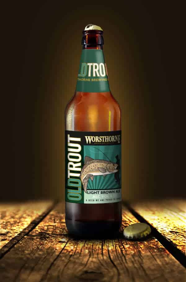
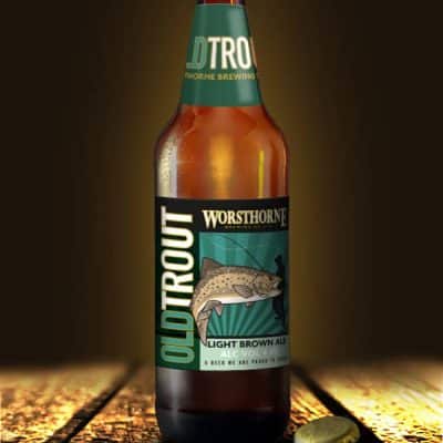
Established in February 2011, Worsthorne Brewing Co Ltd is one of the newest breweries in Lancashire. Despite being relatively new, their beers are quickly gaining a reputation for quality. Today, their products can be found in many pubs and clubs across Pendle, Rossendale, West Yorkshire, the Ribble Valley, and Burnley.
The Challenge
Worsthorne Brewing Co wanted to produce labels for their newly bottled beers. They already had an established branding style, but the goal was to refresh the design. The challenge was to create labels that retained the brewery’s identity while bringing a modern and eye-catching look.
Our Approach
First, we analysed their existing branding to identify key elements that should remain consistent. Next, we explored ways to refresh the visual style, introducing contemporary touches while keeping the labels recognisable as Worsthorne beers.
We focused on creating designs that would stand out on shelves. By using bold typography, clear layouts, and complementary colours, we ensured each bottle looked distinctive and appealing.
We also considered practical production factors, such as print quality, label size, and material choice, to ensure the final product was as functional as it was attractive.
Implementation
Our design process involved multiple iterations. We combined elements of the old branding with new graphical styles to create a fresh, modern appearance. Each label was carefully tailored to reflect the unique character of the beer it represented.
We also ensured consistency across the range. By maintaining a cohesive style, customers can easily identify Worsthorne beers while each label maintains its individual charm.
Results
The new labels successfully revitalised Worsthorne’s bottled beer range. They attracted attention on shelves and reinforced the brewery’s quality-focused reputation.
By blending the existing branding with modern design elements, the labels created a balance between familiarity and freshness. This helped strengthen the brand identity and appeal to both loyal customers and new audiences.
Conclusion
This project highlights the importance of refreshing a brand without losing its core identity. Through careful design and attention to detail, LemonTop provided Worsthorne Brewing Co with a range of labels that are functional, visually appealing, and ready for market expansion.
The result is a modern, cohesive, and professional label set that supports the brewery’s growth while maintaining its established brand identity.