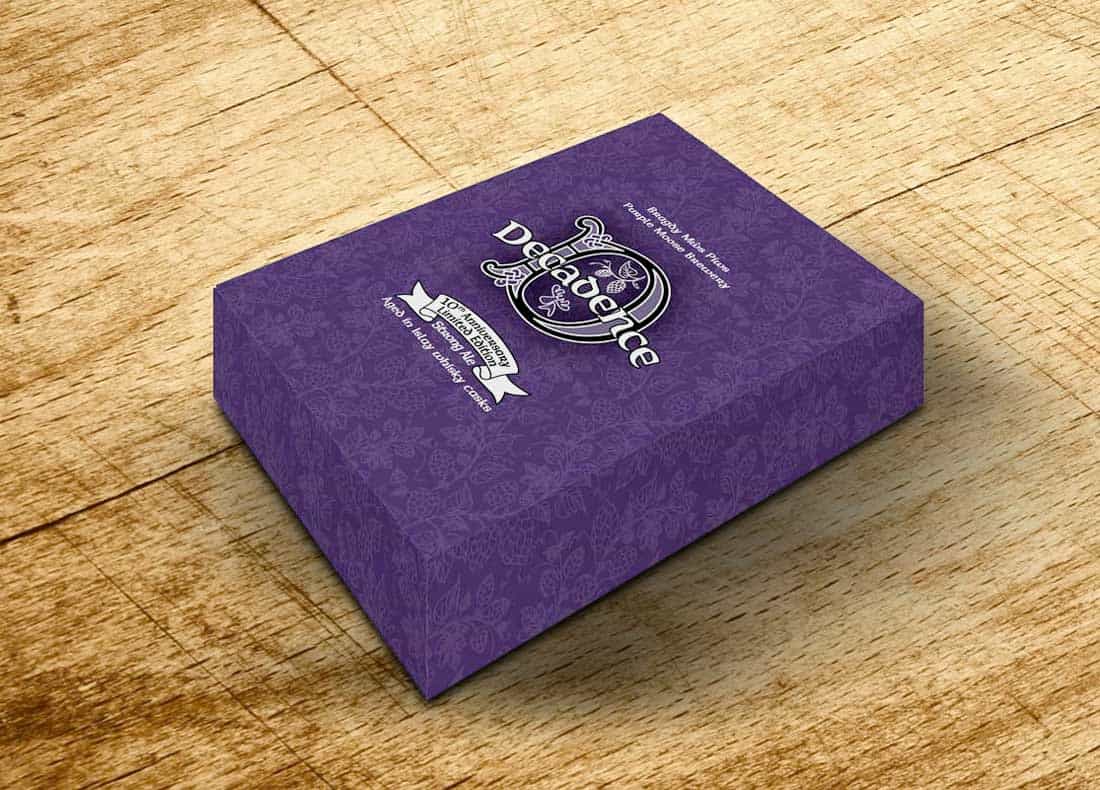
Introduction
Purple Moose Brewing Co wanted to celebrate their 10th anniversary with a special beer and label design.
They approached LemonTop to create a design that would stand out while still feeling like a Purple Moose beer.
Challenge
The main challenge was to make the label look special and premium while keeping the brand recognisable.
In addition, the client wanted silver foiling on the label, adding a sense of celebration and elegance.
Design Approach
First, we studied the Purple Moose brand and the style of their core beer range.
Next, we explored different decorative styles to make the label feel unique yet connected to the brand.
We sketched multiple concepts and tested them, making changes to balance style, readability, and brand recognition.
Then we selected a final design that used ornamental elements and silver foiling to highlight the anniversary.
Typography, colors, and layout were carefully chosen to make the label feel festive but still fit on the shelves.
Packaging Design
After completing the label, we designed a custom presentation box to hold the beer and a tulip glass.
The box design used similar patterns and silver accents, creating a cohesive look with the beer label.
We aimed for a premium feel that would make the gift set attractive for collectors and fans alike.
Outcome
The final label grabbed attention on shelves and clearly felt like a Purple Moose beer.
The presentation box added value and made the product suitable for celebrations or special gifts.
Overall, the project successfully marked the brewery’s 10th anniversary while strengthening the brand’s creative reputation.