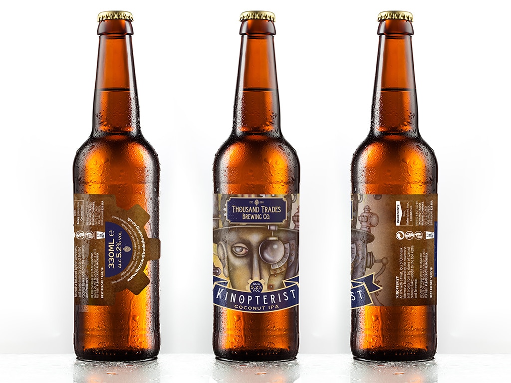
Full steam ahead for Thousand Trades Brewing Co

Thousand Trades Optometrist 330ml Bottle

Introduction

Thousand Trades Brewing Co gave us the exciting opportunity to get creative with their new bottle labels. Since they were launching a series of innovative beers inspired by vintage recipes, this unique approach called for a distinctive design style that would match their adventurous spirit perfectly.

The Concept

Therefore, we decided to lean into a steampunk theme, blending vintage elements with a modern twist. This choice effectively reflected the fusion of old and new present in their brewing process.

To further enhance this theme, we designed a range of die-cut labels featuring intricate shapes and details. As a result, these vintage-looking labels added depth and character to each bottle, helping them stand out on the shelf.

Design Execution

By using rich textures, metallic tones, and classic typography, the labels brought the steampunk world vividly to life. At the same time, each design balanced complexity with readability, ensuring customers could easily identify the beer while appreciating the artistry.

Moreover, the die-cut shapes made the bottles feel special and collectible. Consequently, the designs perfectly aligned with Thousand Trades Brewing Co’s innovative recipes and storytelling.

Outcome

Ultimately, the steampunk labels helped Thousand Trades Brewing Co attract new customers and intrigue craft beer lovers. In doing so, the unique designs strengthened the brand’s identity and showcased their passion for creativity and quality.

Share This Post...

Facebook
Twitter
LinkedIn

RELATED POSTS >

Start a conversation with LemonTop, you never know how far it will take you.

Alternatively you can either call 01642 969222 or email us at hello@lemontopcreative.com

"*" indicates required fields

This field is for validation purposes and should be left unchanged.
Your name:*