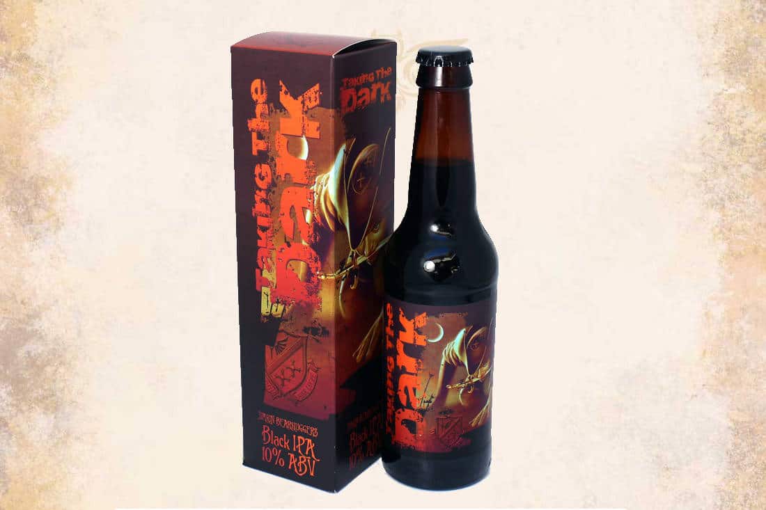
Introduction
After successfully designing various ranges and items for Discworld Ales, the brewery returned with a new challenge. They needed a label and packaging box for their black IPA, Taking the Dark.
This special brew holds unique significance. It is presented to all graduates of the famed Ankh-Morpork Assassin’s Guild — a beer as black as their newly acquired assassin robes.
The Challenge
The design had to embody the dark, secretive world of assassins. At the same time, it needed to look prestigious enough to honour the graduates.
The label and box had to:
- Capture the deep black colour and bold flavour of the IPA.
- Convey the brew’s unique story and connection to the Assassin’s Guild.
- Work as a cohesive set that stands out both on shelves and as a gift.
The Approach
We began by drawing inspiration from the shadowy world of the guild. Dark tones, sharp contrasts, and mysterious symbols became key elements.
The label used rich blacks and subtle textures to hint at the brew’s depth. The typography was bold yet refined, balancing menace with elegance.
For the box, we extended the visual theme while ensuring durability and presentation quality. The packaging turned the beer into a keepsake worthy of the guild’s graduates.
The Outcome
The finished label and box perfectly matched the story behind Taking the Dark. Customers instantly understood the brew’s unique identity through the design.
Together, the label and packaging created a memorable unboxing experience. This elevated the beer beyond a simple product to a collector’s item and a badge of honour for those who receive it.
Conclusion
By combining storytelling with striking design, we helped Discworld Ales bring Taking the Dark to life visually. The project showcased how packaging can deepen the connection between a product and its audience — especially when the story is as compelling as this one.