Middlesbrough Town Hall contacted us and asked us to design a logo for their new beer festival, Craft Beer at the Crypt. They wanted a logo that would work on a range of printed and digital media. Once the logo was complete we went on to design flyers, posters, banners and glassware.
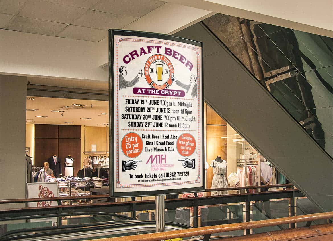
Middlesbrough Town Hall contacted us and asked us to design a logo for their new beer festival, Craft Beer at the Crypt. They wanted a