Skip to content
March 9, 2018
10:57 am
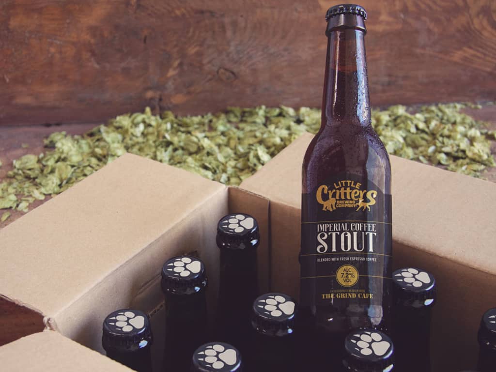
Little Critters Imperial Stout
Little Critters Imperial Stout 330ml Bottle
Share This Post...
Facebook
Twitter
LinkedIn
Prev
Previous
Stannary Bottle and Pump Clip Branding
Next
Eccentric, innovative, genius…meet Wilkinson and English
Next
RELATED POSTS >
Little Critters Imperial Stout
Little Critters Imperial Stout 330ml Bottle
Read More >