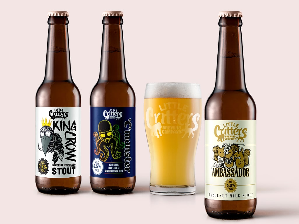
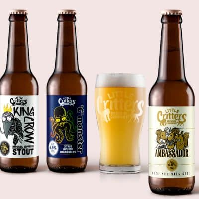
Introduction
Little Critters Brewing Company wanted a fresh look for their new bottle range. They needed designs that were bright, fun, and reflected the quality of their beers.
The goal was to make the bottles attractive on shelves while clearly showing the personality of each beer.
The Brief
The brewery asked for a consistent style across all bottles, so customers could easily recognise the range.
At the same time, each bottle needed a unique look to highlight its flavour, story, and character.
The designs also had to work in other formats, including social media, posters, and promotions, without losing impact.
The Design Approach
We focused on the playful side of the brand, using fun animal illustrations for each beer to give it personality.
Bright, bold colours made the bottles stand out and catch the eye in a busy shop environment.
We created a simple and clear layout, keeping the brewery logo prominent and the beer name easy to read.
Small details like textures and extra illustrations were added to make the labels interesting and memorable.
The style was kept consistent across all bottles to give the range a strong, cohesive identity.
Production and Finishing
We used high-quality, durable label stock so the bottles would feel premium and survive handling, delivery, and storage.
Each design was provided in different formats for printing, online use, and promotional materials, making them flexible for marketing.
We worked closely with the printers to ensure colours remained vibrant and consistent across the full range.
The Outcome
The new bottles stood out on shelves with bold colours, fun illustrations, and a strong, clear brand identity.
Customers responded well, appreciating the playful designs while understanding each beer’s unique character and flavour.
The new range strengthened Little Critters’ brand as a creative, high-quality, and approachable brewery.
The brewery now has a flexible design system they can use for future beers, promotions, and marketing campaigns.