Durham Brewery have just celebrated their 20th Birthday, to mark the occasion they brewed a special one off beer which was to be put into 500ml and 750ml bottles. They asked us to design a label that could be used for both sizes of bottle along with any other elements that we thought would help make the bottle look a little bit different and more celebratory to their core range. The labels were printed onto clear stock and we used a neck tag for both bottles and then topped the 750ml bottle off with a label which covered up the swing top.
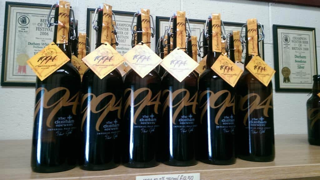
Durham Brewery have just celebrated their 20th Birthday, to mark the occasion they brewed a special one off beer which was to be put into