Introduction
TrueFitt’s Tap, a new pub in Northallerton, approached us to create a bold and engaging advertisement flyer. They wanted a design that would attract local customers, showcase their offerings, and provide clear guidance on how to find the venue. Given that this was their first major promotional piece, the flyer needed to combine visual appeal with practical information.
The Challenge
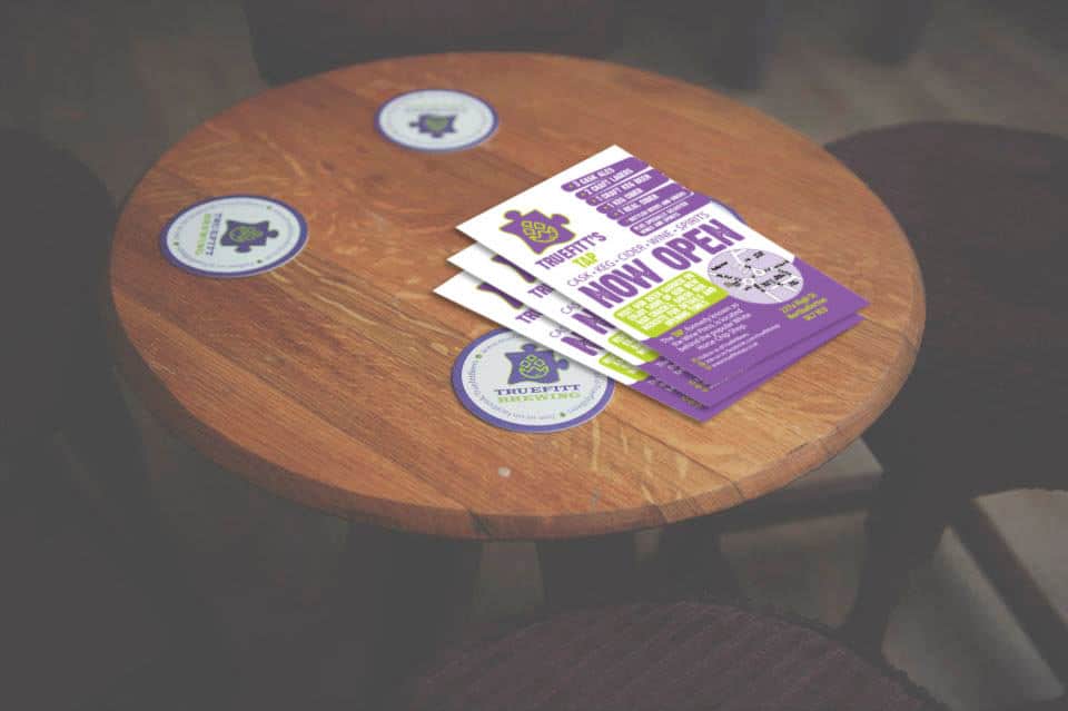
The primary challenge was to design a flyer that not only caught the eye but also communicated key details quickly. TrueFitt’s Tap offers a variety of drinks, including real cider, three cask ales, and two craft lagers, alongside a beer garden and new bar snacks. Additionally, the flyer needed to provide a map to ensure visitors could easily locate the pub. This required a careful balance between aesthetics and functionality, making the information visually digestible without overwhelming the reader.
Our Approach
We began by analysing the brand identity of TrueFitt’s Tap and the style they wanted to convey. They desired a bold, modern, and approachable design that reflected the welcoming atmosphere of the pub. With this in mind, we used bright colours, clear typography, and engaging layout elements to make the flyer stand out from other local promotions.
Next, we added a small, clear map, ensuring that first-time visitors could find the pub easily. To further engage the reader, we highlighted the drinks menu and key features of the pub, including:
- Real cider
- Three cask ales
- Two craft lagers
- A beer garden
- New bar snacks
We structured the flyer to lead the reader naturally from the pub’s name, to its offerings, and finally to the map. This created a clear flow, helping potential visitors absorb the information quickly while maintaining their interest.
Results
The final flyer successfully captured the essence of TrueFitt’s Tap. By combining bold visuals with clear, easy-to-read information, the flyer immediately drew attention and informed potential customers about the pub’s offerings. The inclusion of the map also eliminated any uncertainty about the location, encouraging more people to visit. Overall, the flyer provided a seamless mix of promotion and guidance.
Conclusion
Through careful design and a thoughtful layout, we created an advertisement flyer that was both visually striking and functional. By using transitional design elements, highlighting key features, and incorporating a helpful map, the flyer effectively promoted TrueFitt’s Tap, driving awareness and foot traffic. This project demonstrates how clear communication, strategic design, and thoughtful presentation can help new businesses connect with their audience and establish a strong presence in their local community.