Introduction
When Norfolk ’n’ Good Brewery decided to brew their innovative 330ml Coconut IPA, they weren’t just introducing another beer to the market—they were making a statement. This was a drink with a distinctive tropical twist, designed to surprise seasoned craft beer drinkers while tempting newcomers into the world of IPAs.
The challenge? The beer’s branding and packaging had to reflect the uniqueness of what was inside the bottle. This is where LemonTop Creative came in. Known for our expertise in brewery branding, beer label design, and craft beer packaging, we understood from the very beginning that Norfolk ’n’ Good needed more than just a label. They needed a visual identity that told the Coconut IPA’s story before the cap was even twisted off.
This case study takes you behind the scenes of how we created a design that not only looked stunning on the shelf but also elevated Norfolk ’n’ Good’s position in the craft beer market.
About Norfolk ’n’ Good Brewery
Norfolk ’n’ Good Brewery is a proudly independent craft brewery rooted in tradition but unafraid to experiment. Based in the heart of Norfolk, they’ve built their reputation on producing beers that balance classic brewing methods with contemporary flavour profiles.
Their name itself—playful, memorable, and full of personality—has always been part of their charm. Norfolk ’n’ Good’s branding captures the region’s rich heritage while embracing a bold, cheeky character that resonates with modern beer lovers. This personality makes them a perfect partner for creative design work, and it set the tone for our entire approach.
The Brief
The Coconut IPA was a bold new venture for Norfolk ’n’ Good. The beer had:
-
A tropical twist thanks to the infusion of coconut.
-
A smooth, refreshing body balanced with the hoppy bitterness of a traditional IPA.
-
A smaller, 330ml format to appeal to both casual drinkers and those who prefer a premium, craft presentation.
The design brief was simple yet challenging:
Create a label and packaging concept that communicates the tropical flavour profile, captures Norfolk ’n’ Good’s personality, and stands out in a competitive craft beer market.
We needed to balance vibrant creativity with brand consistency, ensuring the Coconut IPA was unmistakably Norfolk ’n’ Good while still having a visual identity of its own.
Research & Discovery
Before touching pen to paper, we dived into research.
-
Market Analysis – We explored existing craft beer packaging trends, particularly in tropical IPAs. Many leaned heavily on bright, saturated colours and playful illustrations. Our goal was to take inspiration from these trends while pushing Norfolk ’n’ Good’s distinct brand personality to the forefront.
-
Competitor Review – We studied competing breweries’ coconut-infused beers, identifying both overused design tropes and opportunities for differentiation.
-
Brand Audit – We reviewed Norfolk ’n’ Good’s existing brand assets—logos, fonts, colour palettes—to ensure our work complemented and enhanced their established identity.
-
Consumer Insights – We looked at who buys 330ml craft beers, noting that this format often appeals to customers seeking premium, “treat yourself” purchases. The design had to speak to that mindset.
Creative Concept Development
Defining the Look & Feel
Our first creative step was to define the look and feel of the Coconut IPA’s identity:
-
Colour Palette – We opted for warm, tropical hues inspired by sandy beaches, golden sunsets, and coconut shells, contrasted with refreshing teal and aqua tones to evoke the IPA’s crisp finish.
-
Typography – Bold, modern sans-serif fonts to project confidence, paired with playful display type for the beer name to convey fun and approachability.
-
Imagery & Graphics – Abstract coconut motifs combined with wave-like patterns hinted at both flavour and refreshment without becoming overly literal.
Three Initial Routes
We presented Norfolk ’n’ Good with three potential directions:
-
Tropical Minimalism – Clean layouts with subtle coconut iconography and minimal colour blocking.
-
Playful Illustration – Quirky hand-drawn elements and a looser, more casual vibe.
-
Bold Impact – Large, attention-grabbing shapes with high-contrast colours and layered textures.
Ultimately, we moved forward with a blend of Playful Illustration and Bold Impact, which perfectly reflected the brewery’s adventurous spirit.
Design Execution
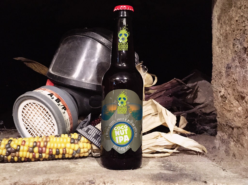
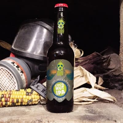
The Label
The 330ml bottle label became the hero of the project. Every detail was deliberate:
-
Front Label – Eye-catching central logo placement, beer name in oversized type, and subtle coconut illustrations integrated into the background texture.
-
Colour Accents – Golds and creams for the coconut notes, turquoise for refreshment, and a pop of coral red to energise the composition.
-
Texture Layers – A slightly distressed overlay gave the design a handcrafted, artisanal feel without sacrificing clarity.
Back Label
We kept the back label clean and functional—ingredients, ABV, and brewery details—while using brand-consistent icons and layout to maintain a polished appearance.
Neck Label
A matching neck label completed the package, reinforcing the Coconut IPA’s visual identity and creating a cohesive presentation on the shelf.
Production Considerations
Designing for a physical product means thinking beyond the screen:
-
Print Finishes – We recommended a matte varnish with spot UV highlights on the beer name for tactile contrast.
-
Stock Choice – Premium, uncoated paper stock gave a natural feel and improved colour richness.
-
Sustainability – We worked with Norfolk ’n’ Good to ensure all packaging materials were recyclable, supporting their commitment to eco-friendly practices.
Marketing Integration
The Coconut IPA’s launch wasn’t just about a great-looking bottle—it was about telling a story. We extended the design into:
-
Social Media Assets – Branded imagery and animations to build anticipation before release.
-
Point-of-Sale Materials – Posters, beer mats, and shelf talkers to catch customers’ eyes in retail spaces.
-
Website Features – Dedicated product pages with lifestyle photography matching the packaging aesthetic.
By aligning all marketing touchpoints with the new design, we ensured customers encountered a consistent brand experience wherever they discovered the Coconut IPA.
The Result
The Norfolk ’n’ Good 330ml Coconut IPA launched to enthusiastic reception from both retailers and customers. Highlights included:
-
Increased Shelf Visibility – Retailers reported the beer catching customer attention quickly, often leading to impulse purchases.
-
Positive Customer Feedback – Social media posts showed customers proudly sharing photos of the bottle, tagging Norfolk ’n’ Good.
-
Brand Positioning Boost – The Coconut IPA’s premium look reinforced Norfolk ’n’ Good’s reputation for innovation and quality.
Client Feedback
“Working with LemonTop Creative was a smooth, inspiring process from start to finish. They really got our brand, and the Coconut IPA design has become a talking point with our customers. It’s helped us stand out not just on the shelf, but in the market.”
— Norfolk ’n’ Good Brewery
Lessons Learned & Industry Insight
This project underscored a few important truths about brewery branding and craft beer packaging:
-
Flavour Should Drive Design – The tropical coconut element influenced every visual choice, creating a genuine link between taste and appearance.
-
Brand Personality Matters – Norfolk ’n’ Good’s cheeky, confident personality gave us creative freedom to produce something bolder than a generic craft beer label.
-
Small Details Add Big Value – From spot UV highlights to subtle background textures, these refinements elevated the final product.
Looking Ahead
Following the success of the Coconut IPA, Norfolk ’n’ Good Brewery is exploring additional seasonal and experimental beers. LemonTop Creative will continue to support them with distinctive, memorable designs that bring their flavours to life visually.
This case study stands as proof that when brewery branding and beer label design are approached with strategy, creativity, and attention to detail, the results speak for themselves—in sales, in customer loyalty, and in brand recognition.