In 2013, Rachel Matthews asked us to create a full set of bottle labels for her Dancing Duck range of beers. Rachel and her husband Ian had opened Dancing Duck brewery in 2010 and by 2013 had successfully produced a range of 10 beers, winning a few awards along the way.
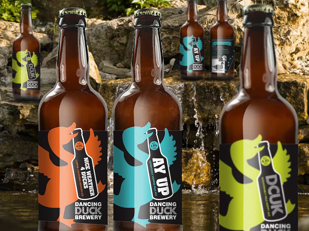
The brewery name and logo were inspiration enough for our creative team. We created a series of visuals based on the Dancing Duck theme and soon agreed on the way forward. The front of the bottles would simply be the Dancing Duck in different, bright and eye-catching colours. It worked really well and the visual impact was truly stunning, especially when viewing the full range together.
In the summer of 2017, Rachel decided the time was right to move forward with both the brewery and her range of bottled beers so asked us to freshen up the designs to reflect the exciting changes she had planned for the growing brewery. She wanted to keep the bold central Dancing Duck image but change the way the bottles displayed the beer name, ideally with both the name and the Dancing Duck sharing centre stage. Our creative team went to work and after creating a set of visuals, presented an idea showing the Dancing Duck holding a bottle with the beer name on the front of it, an ideal way to share centre stage.
The reverse of the bottle label was updated with a flavour wheel, a colourful and effective idea Rachel had developed to give customers a better idea of the taste they would experience.
The original labels had quite a unique die cut shape, giving the effect of the Dancing Duck breaking out of the label. We decided from the outset that this was one of the things that made the bottles stand out so we modified the shape to ensure the Duck still danced out of the label.
As always, working with the Dancing Duck brand allowed us to be truly creative with both images and editorial. Rachel is always open to new and innovative ideas, often sharing her thoughts and adding a little extra to create something really special.
The resulting labels have given a fresh new look to an already established range of beers and given Rachel more food for thought as she pushes Dancing Duck to a new and exciting level.
If you’d like to discuss with us how we can help develop your brand, why not contact us today?