Chris John & Garry White created Stannary Brewing Company in April 2016, initially brewing just a Pale Ale and a Bitter on a 2.5 BBL system. In August 2016, they further expanded the brewery by opening a taproom where people could share in their passion. They now boast a range of nearly 20 beers that are brewed throughout the year in a variety of different styles from Pales to Porters and IPA’s to Saison’s.
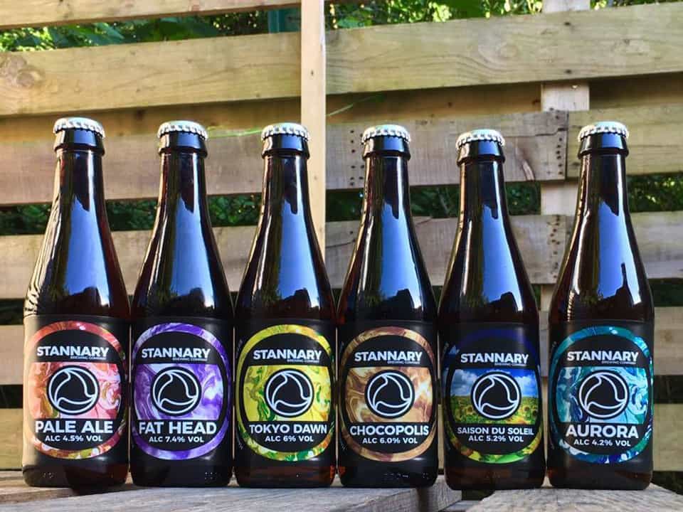
Chris knew the time was right to update their brand and decided to ask LemonTop to create a bright, eyecatching design for the pump clips and bottle labels. He wanted the brand to be instantly recognisable, with a consistent image across the whole range. After experimenting with different illustrative styles and a variety of shapes, we decided to echo the logo and use an uncomplicated circle as the basis of the designs. The reason was simple. A return to a traditional circle would stand out against the many beers on bars today that use unusual shapes and die-cuts.
Until recently it has been the industry standard to educate drinkers that good beer should be clear beer. Stannary Brewing believe ‘Real Beer is Not Clear!’ They believe yeast and hop compounds left suspended in the beer bring more flavour so why get rid off them? All Stannary beers are un-fined, unfiltered and served with a natural haze. This was illustrated on the designs we created using a colourful, abstract, swirling pattern as a background. Each beer used the same consistent background image but we created variations in colour to differentiate between the beer styles and tastes. Again, the simplicity of the design helps Stannary to stand out against the crop of complicated illustrations many other brewers are using.
The same formula was applied to the bottle labels. Keeping text to a minimum and using circular shapes throughout the design meant the labels were clean and uncluttered, yet bold and eye-catching. Although the style is consistent across the range, the variation in colour gives each bottle it’s own unique look.
Throughout the process, Chris and Garry were open to ideas and gave us all the input we needed to create something that would stand out on a busy bar. This bold and colourful style was extended across a range of different promotional items from Table Talkers through to Magazine Advertising, giving the whole brand a unique and striking identity.
Starting life as crazy hop-loving home-brewers learning to brew beer from books and the internet on homemade brew kits, Stannary Brewing now make nearly 20 great tasting beers that everyone can enjoy from their brewery in Tavistock, Devon. Stannary Brewing are bucking the trend with their brewing, their beers and now, with the help of LemonTop Creative, their branding.
Why not contact us today and see how we can help you realise your ideal brand design.


